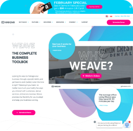
Partnered with Fishbowl Inventory, Quarium serves small business owners, QuickBooks Professionals, and accountants. The goal was to create a website to showcase the product and allow clients to access their servers.
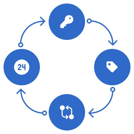
Many users complained of hidden fees and confusing information displayed on hosting sites. Easy access outside of the office and 24/7 support attracts the basic user in need of a hosting service. Small business owners often dismissed the product previously due to lack of awareness of the various users Quarium serves. Many of the terms needed to be changed to expand their audience.
- Hosting companies with similar services
- Clear goals and services
- Badges (Intuit Badge)
- Simple flows
SEO keywords - CTA (purchase/login) -
Simple & Accessible - Availability
As sole designer for the project, I worked with the product manager, VP of Marketing, CEO, CTO, and developers to create a hosting site that solved the many issues users found in other hosting sites. The product release was delayed due to changes in the team's developers. Once released, SEO keywords and purchase buttons were added to increase site traffice and purchases.
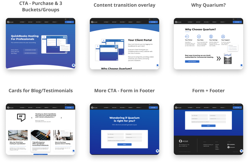
FIGMA FILEWebsite Flow
Wireframes
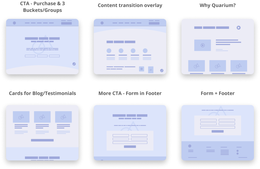
High-Fidelity Screens
User testing showed us that the website was an improvement from the previous site. Clients were able to get to their servers quickly and receive support for their issues and concerns in various ways without too much delay. An increase of site traffic from uncommon user types did not occur until months after the release. However, purchases almost doubled shortly after the release.
My design process improved throughout this project. I created a component library and style guide that helped developers to build the website fairly quickly and without many necessary changes. Next steps for the project are for the developers to finish making the site more responsive for smaller screens.
The website and new client portal have helped Fishbowl Inventory (their parent company) with many hosting issues. Users can now access their servers and have all of their hosting concerns solved due to this site.
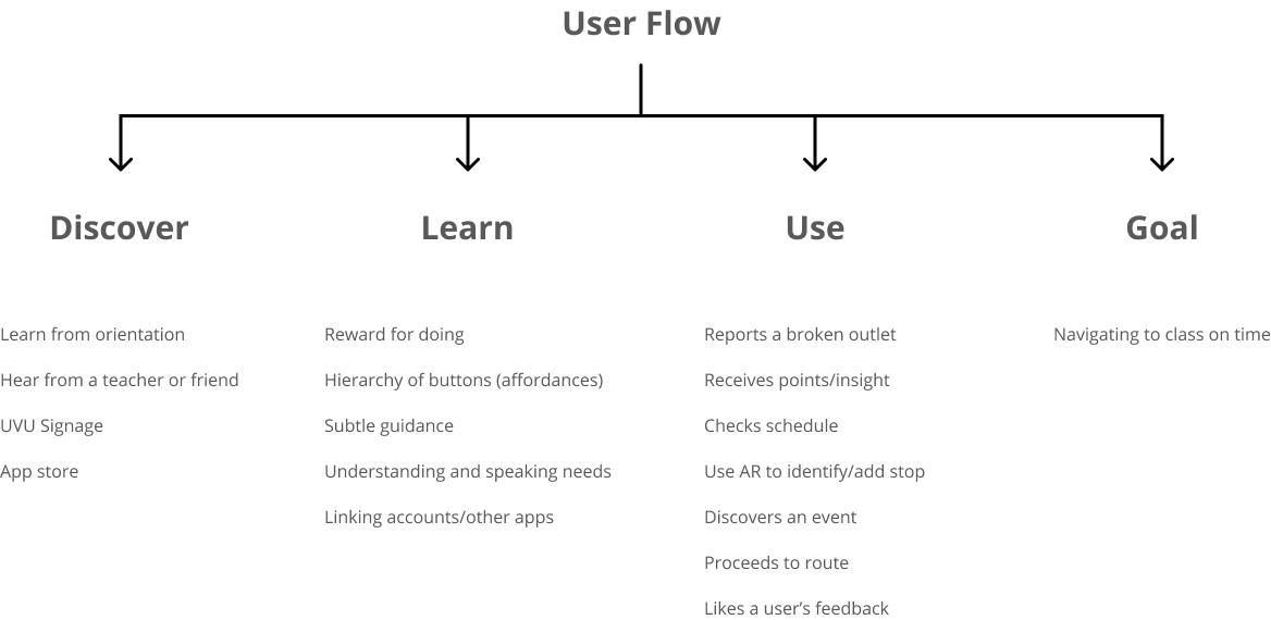
For a thesis project, I performed a research study on accessibility at Utah Valley University's campus. The thesis was published with an app prototype in 2019. This mobile app was designed based on this research.
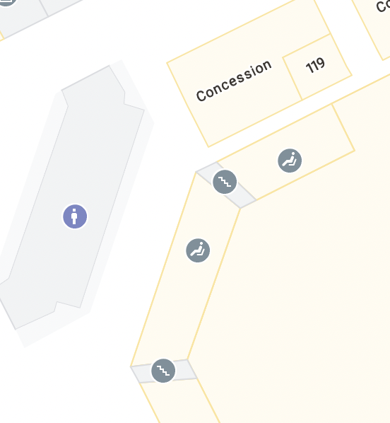
Utah Valley University is the largest campus in Utah. Although the university provides tours almost everyday, students, faculty, and others would often complain about the lack of proper directional signs and issues with finding offices or other areas on campus. Other challenges that were heard around campus were accessibility issues - finding ramps or elevators. Due to this information, I designed a questionnaire and surveyed 1,000 students on campus, and performed a focus group. Based on the results of these studies, I designed a mobile app to solve many of the accessibility issues.
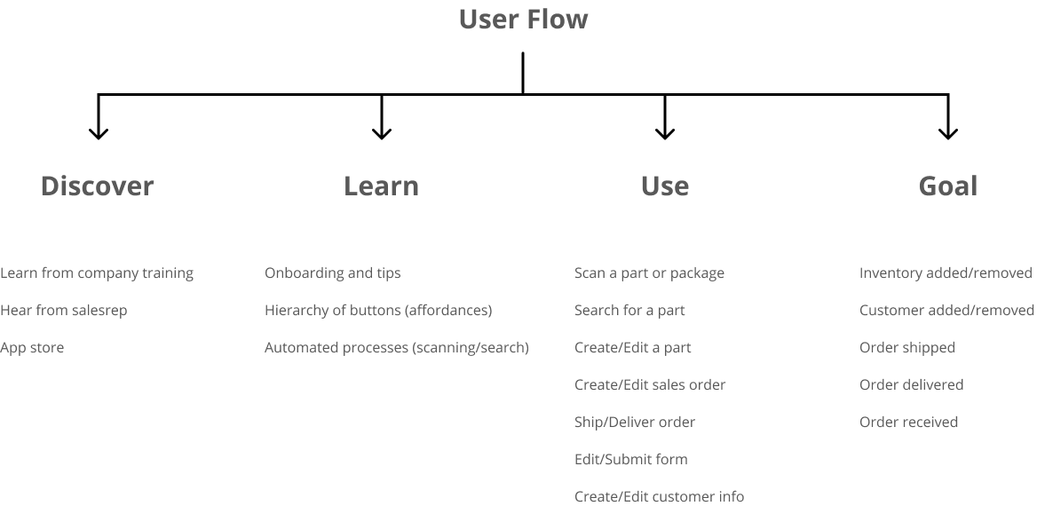
Uber, Waze, Lime, and Google Maps
- Multiple filters
- Live feedback
- User-based info
- Locator icons
- Timing
- Tracking
- Planning
- Reporting
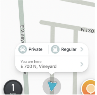
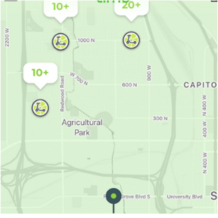
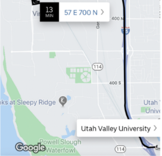
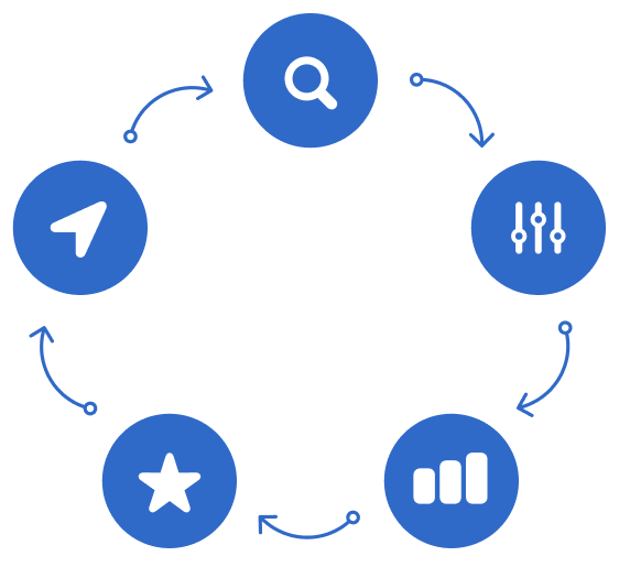
Search - Adjust preferences - Earn points - Rate path - Navigate
I collaborated on the research with other designers and researchers. The other designers and I mapped out flows and simple prototypes to test around campus. We went through 4 sprints, 108 unofficial survey responses, 36 app audits, and 20 user tests. Halfway through the project we had a light bulb moment and added a feature for AR navigation. Once we established a design flow and layout, I began designing the research study and prototype.
User Flow
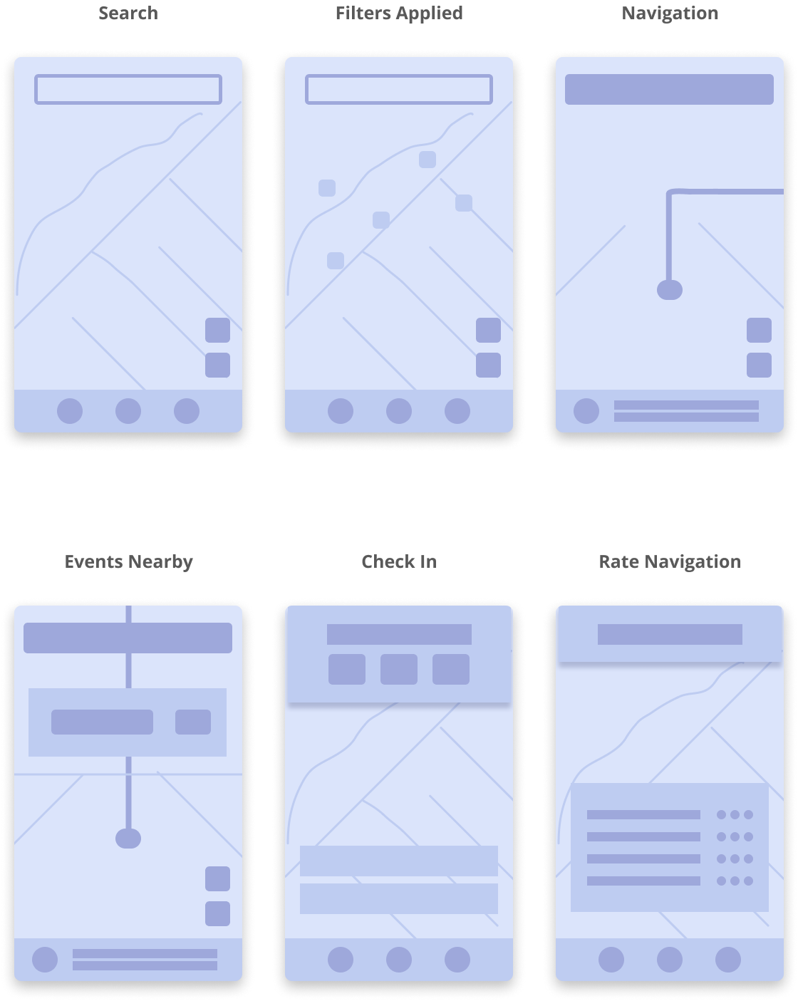
Wireframes
High-Fidelity Screens
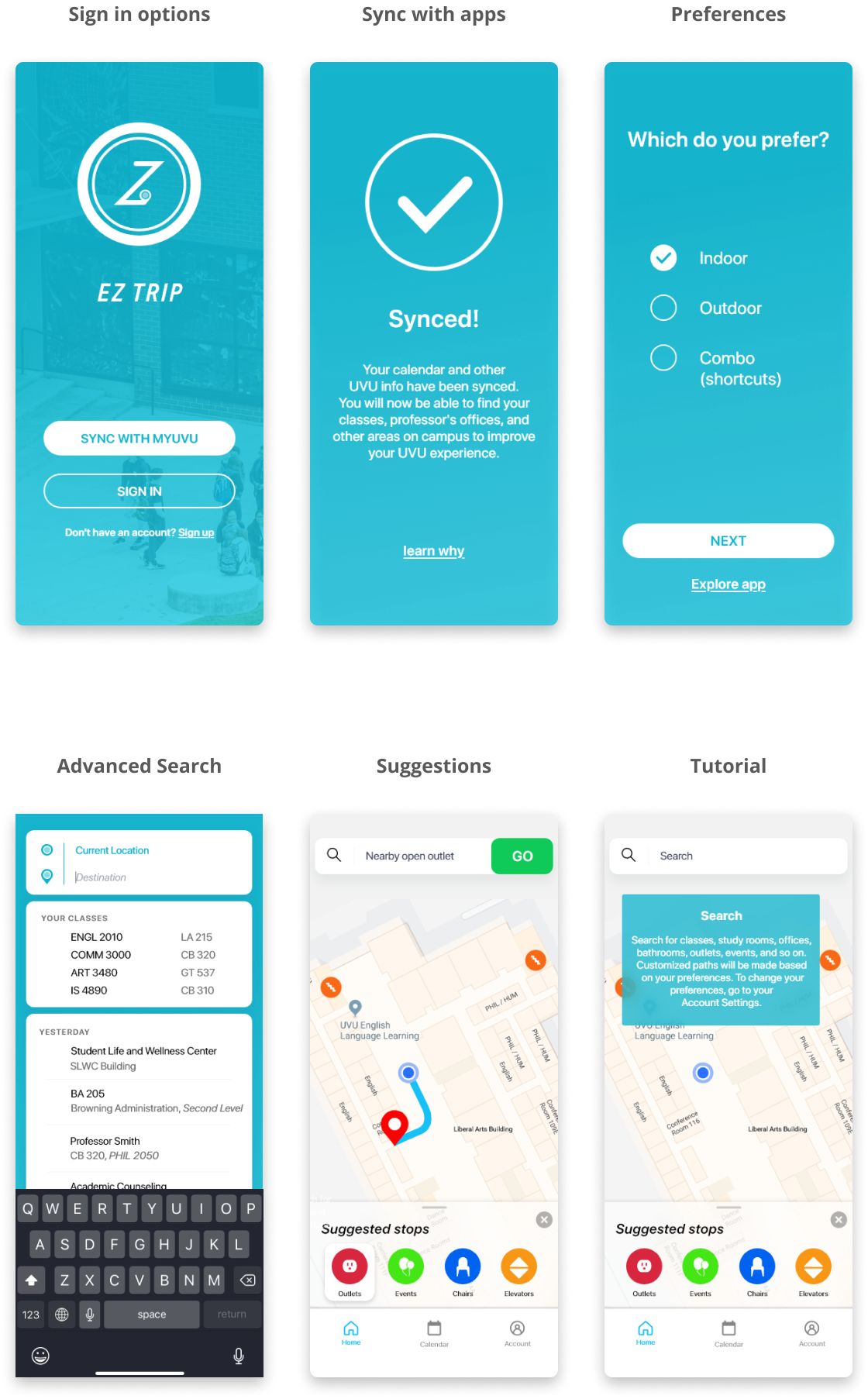
In early designs we had a feature to report resources. For instance, if there was the early tests, we learned that there were no big incentives for people to report resources. This type of reporting would allow users to report issues around campus like broken outlets or other issues. We later implemented a redeemable point system. Early testing also showed that users were confused as to how to apply filters and use other features. Onboarding questions and tutorials were applied to the designs to fix this issue.
After my team's research and my thesis was published, Google released an interior navigation feature to Google Maps. Although our app concept included features of locating events, calendar syncing, and AR navigation, the main concept of the app stopped future development.
Fishbowl Inventory is a company that provides inventory management solutions for small to medium-sized companies. There was a need for an iPad and tablet app for Fishbowl. The goal was to provide many of the features of the desktop app and simplify the flow for the basic user.
Clients of Fishbowl include: manufacturers, accountants, business owners, and other users in need of inventory management. Users often complain about the need to click or tap on a screen multiple times while wearing gloves in the warehouse. Other issues included: wanting color back for the different modules and simplifying actions (scrapping parts, issuing a sales order, etc).
Sortly, Inventory, BoxStorm, Fishbowl Desktop
- Simplified flows
- Fixed action buttons
- Simplified search
- Simplified details
- Fixed menu
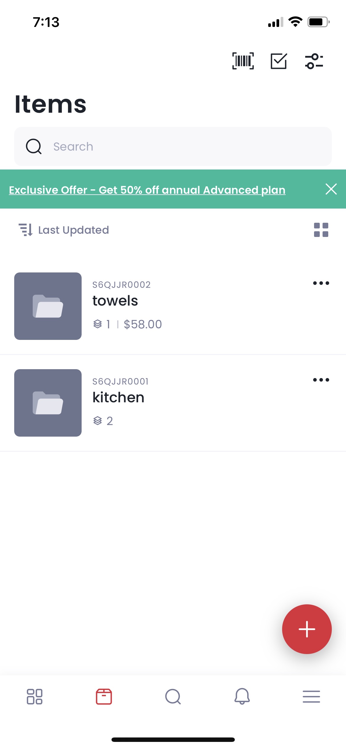
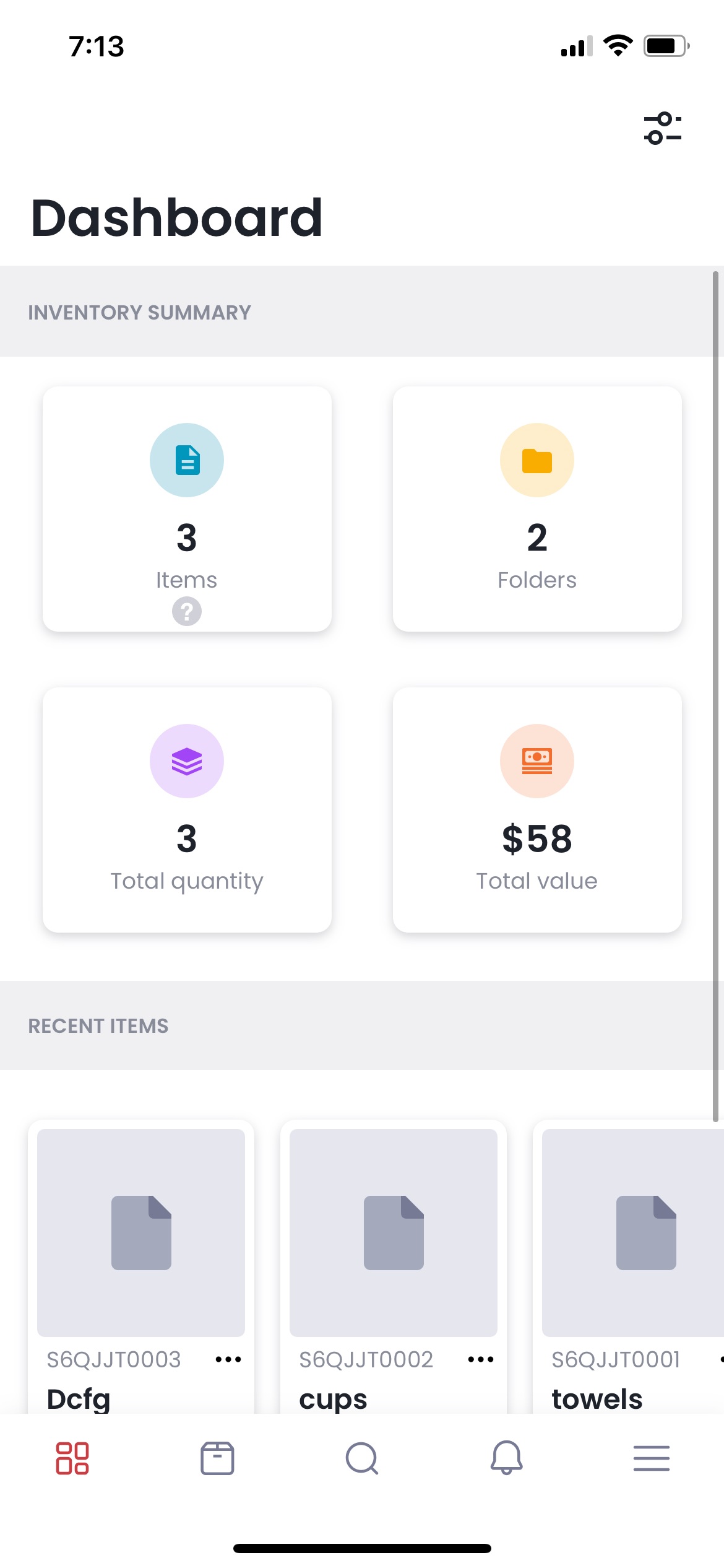
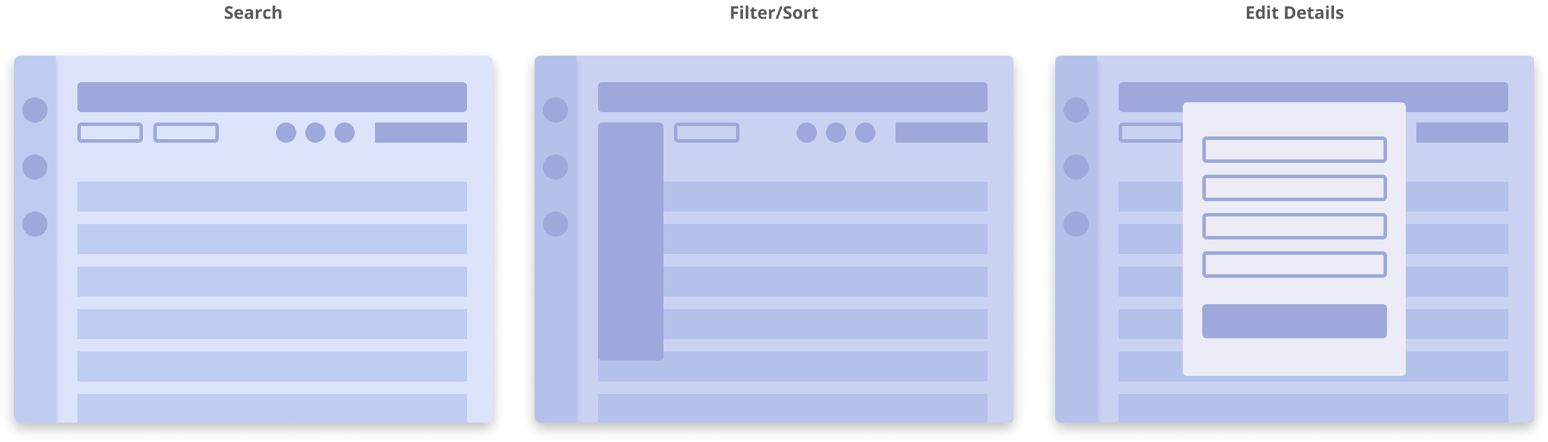
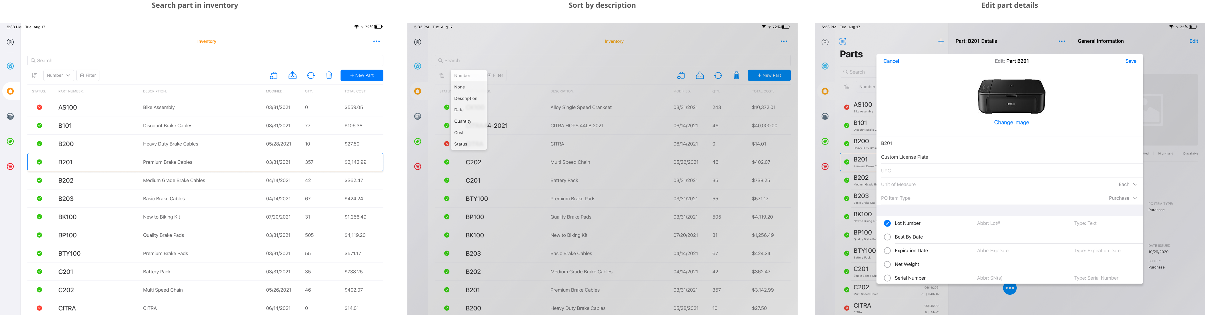
Search or Scan - Filter/Sort - View/Edit Details - Action for Item
Much of the user research was already completed when I joined the team. My role in the project was to design a simple flow and layout based on the current apps at Fishbowl and user requests. Design sprints occurred twice a week going over roadmaps, flows, wireframes and high fidelity screens. The project was delayed for future release due to requested features and capabilities.
FIGMA FILEUser Flow
Wireframes
High-Fidelity Screens
My team and I simplified the actions and search functions of the various modules. To simplify the code, I used various native ios elements for the design. The design for the iPad simplified the flow that the desktop app lacked and used the available landscape that the iPad could provide.
The prototype has inconsistencies and limitations due to some challenges. I learned the delicate balance between directing a design sprint meeting toward our goals and letting a plan take us a different direction that might lead us away from those goals. Eventually we would either have a great finished product or a design concept for the future. I adapted accordingly and it resulted in a design concept for the future.
Fishbowl Inventory is a company that provides inventory management solutions for small to medium-sized companies. There was a need for an iPad and tablet app for Fishbowl. The goal was to provide many of the features of the desktop app and simplify the flow for the basic user.
Clients of Fishbowl include: manufacturers, accountants, business owners, and other users in need of inventory management. Users often complain about the need to click or tap on a screen multiple times while wearing gloves in the warehouse. Other issues included: wanting color back for the different modules and simplifying actions (scrapping parts, issuing a sales order, etc).
Sortly, Inventory, BoxStorm, Fishbowl Desktop
- Simplified flows
- Fixed action buttons
- Simplified search
- Simplified details
- Fixed menu
Search or Scan - Filter/Sort - View/Edit Details - Action for Item
I did not have much access to the user research and testing. My role at Fishbowl was a UI/UX Designer working under a product manager and app developers. The goals and roadmaps were inconsistent throughout the project. Due to the challenging collaboration, the project was greatly delayed. I made several iterations according to the changing plans and preferences. The finished prototype was made according to feedback from support and other employees.
FIGMA FILEUser Flow
Wireframes
High-Fidelity Screens
My team and I simplified the actions and search functions of the various modules. To simplify the code, I used various native ios elements for the design. The design for the iPad simplified the flow that the desktop app lacked and used the available landscape that the iPad could provide.
Many issues, like the typical dysfunctions of a team and coding limitations, greatly delayed the release of the app. The prototype has some inconsistencies and limitations due to these challenges. I learned the delicate balance between directing a design sprint meeting toward our goals and letting a plan take us a different direction that might lead us away from those goals. Eventually we would either have a great finished product or a design concept for the future. The main goal of the department was not to have a deadline but to have a potentially great product without that added pressure. I adapted accordingly and it resulted in a design concept for the future.